

Siege and Storm by Leigh Bardugo
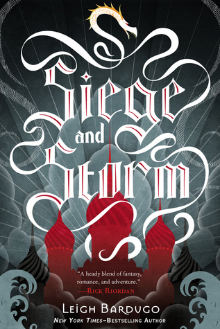
I adored the cover for Shadow and Bone, and I totally think the cover for this one is a perfect contrast. It just screams EPIC! The title is beautiful, both the font and the coloring. I love the way the clouds are formed behind the castle-like structure and it makes it even better that the towers are highlighted in red while the rest is black.
What do you think?


Không có nhận xét nào:
Đăng nhận xét